(originally published 2016-04-13T19:25:54Z)
I recently came up with an interesting question: given that I like to use Hubway bikes, what is the fastest way to get from my dorm to my classes? Hubway, in case you don't know, is a bike sharing system that lets you take a bike from one Hubway 'station', ride it around for half an hour, and then return it to another station. There are five Hubway stations in and around MIT, so I suspected that in some cases, walking to the nearest station, riding to another station, and then walking to class might be faster than the long walk from my dorm.
Using a Google Maps API and node.js, I wrote a program to gather all the transit time data for each point on the map and then export it in GeoJSON format. I used CartoDB, an online GIS mapping service, to create this nice map from all files the program produced. All the code is available here.
The Map
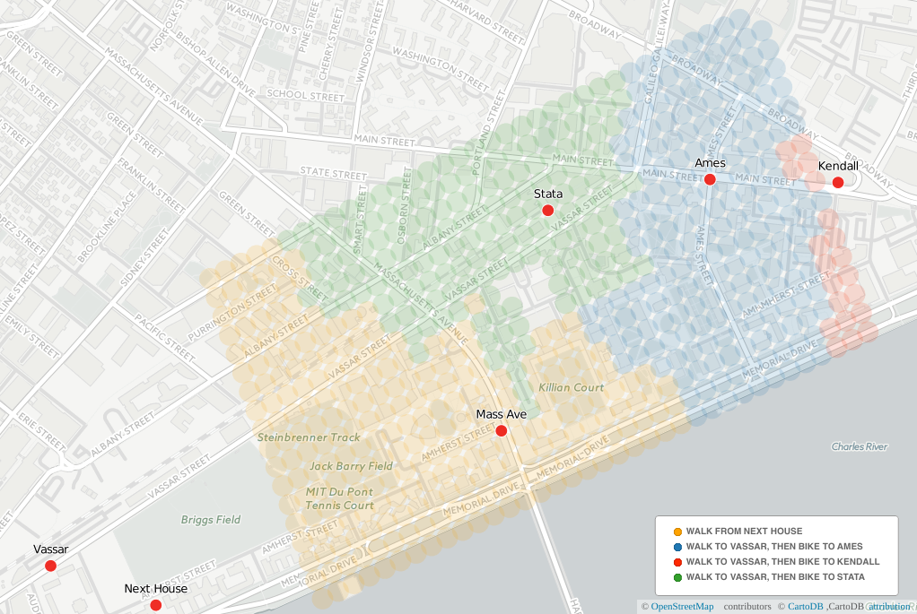
The red dots indicate Hubway stations and my dorm (Next House in the bottom left). The colorful region of the map is the part of campus that I go to most frequently - mostly other dorms and academic buildings. The color of each dot represents the fastest route there - if I'm trying to go somewhere in the blue region, the map says I should walk to the Vassar station, bike to Ames, and then walk the rest of the way. This map only applies to my dorm - a different starting point would yield a much different map.
Some interesting things to notice:
-
It is faster to walk to the Mass Ave. station than it is to walk to the Vassar station and ride to Mass Ave. The program evaluated both routes, but since it was apparently always slower to bike than to walk, the biking route doesn't show up on the map.
-
The boundaries of the colored regions are bit confusing. In a few places, the map advocates some counter-intuitive paths. If you look at the Kendall station, for example, the map shows that it's faster to bike to the Ames station and then walk to Kendall than it is to just bike to Kendall. The API I used to get the times for this map, the Google Maps Distance Matrix API, only gives me times and distances, not routes, so it's hard to see what Google Maps was thinking for each route.
-
I can actually save some time by biking! A lot of my classes are near the blue-green border, so biking will definitely be faster than walking.
Going Forward
There are still a few things I'd like to add to this project:
-
Voronoi regions. Rather than using overlapping dots, I would love to have bunch of nice, uniform, space-filling polygons to represent the times to each location. Using Voronoi regions seems to be possible with most mapping programs, but I'll have to learn more before I can implement this.
-
Optimization. The program could be more efficient with its API calls, which would save time and allow for increased resolution. The free tier of the API only allows for 2500 locations to be queried per day, and the map above used most of that quota.
-
A user interface. Right now all the information defining Hubway locations and map boundaries is hardcoded in the program, but an interface would certainly be easier to use.
Let me know what you think of the map! I hope other people will find a map like this useful.